RSS

CoronaVirus Model – What level of suppression is enough to match ICU capacity?

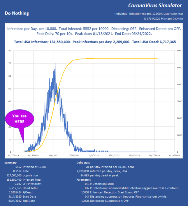
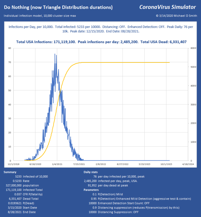
Last week I posted a bit about my model that shows infection progression on an individual basis, with a population size of 10,000.  I have added some new features and explored a lot of factors now.  I’m particularly interested in what level of suppression can be applied to avoid constraints like ICU bed capacity or PPE.  The disease continues to progress exponentially, while our efforts to measure and contain it seem to be linear.  I don’t think many people really understand what is implied if  you just let a situation like that run free.  It is a horrific outcome, and it takes a long time too:

2020-03-24 21_18_10-Window.png

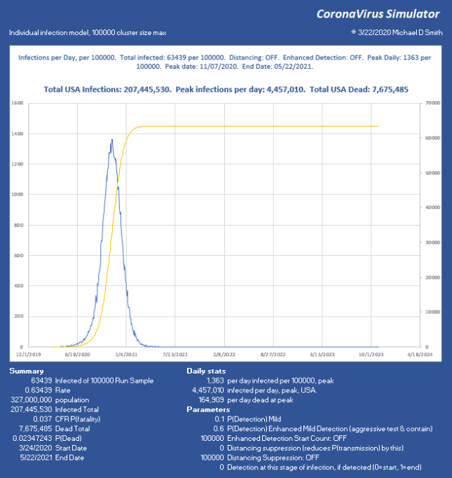
For a little perspective, find the peak number of infections per day, USA on that chart.  About 6% will need ICU, so multiply by 0.06 .  That is how many intensive care beds you need PER DAY, so in this case, 267,420 per day.  The USA has maybe 100,000 ICU beds, of which about 68% are typically full, leaving us 32,000 beds total, which will already be overflowing from yesterday and the day before in the “Do Nothing” case.  For the people who cannot be treated… that is not going to be a nice way to go.  If severe cases take about 31 days to resolve, you really can handle only about 1000 patients per day for 32 days as they rotate in and out.  In the USA.  That’s it.  You aren’t going to get to 267 times that in ventilators.  Ever.  Not in PPE either.  This explains why aggressive distancing has been employed here in the USA lately, with leaders begging us to pay attention.

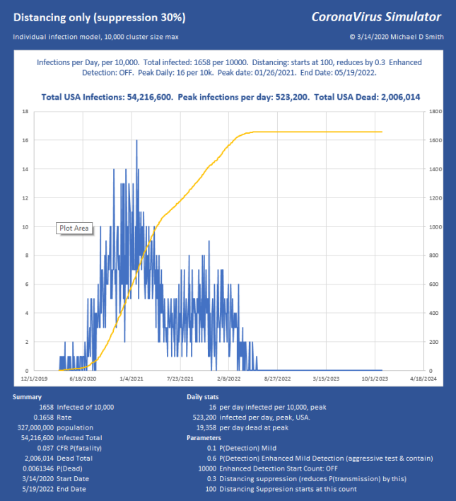
So, how do we keep total ICU bed demand below 1000 per day?  Slam the door shut.  This is what China did.  Without using any aggressive detection, and assuming all that we can do is separation, I use a factor that simulates the effectiveness of suppression.  So 70% means I reduce the chance of infecting the next victim by this much.  If you aggressively either contain (which requires detection) or separate (which doesn’t), it can be over with and fizzle out in only a few generations.  Here is 70% reduction in transmission, starting at an infected count of 250 out of 1,000,000:

2020-03-24 22_04_33-Window.png

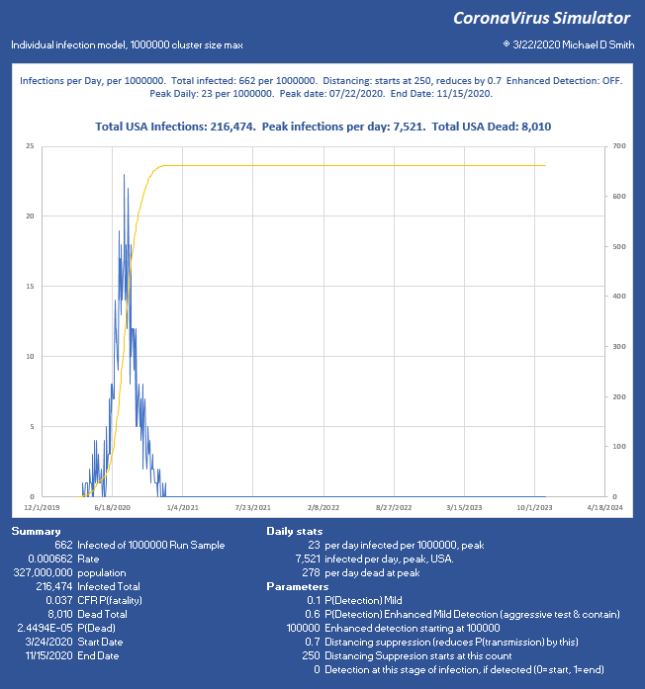
Good news, we keep it at 0.066% infected total.  We started interfering at 250, but it reached 662 infected, so it lingered a few generations before collapsing and still infected 412 more.  The peak is 7520, which (times 0.06) is below our target of 1000 ICU beds per day, so we can use even less suppression.

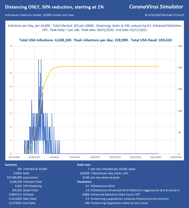
I chose 250 starting count because we now have some information about the base infection level.  The CDC reported today that about 1 in 1000 New York City dwellers is currently infected.  Assuming a doubling every 3 days, and that we applied separation about a week ago (about 2 doublings ago), I will take a population of 1 million, and show what only 40% effectiveness of separation does at a starting count of 250 (1,000,000 * 0.001 / (2^2)).

2020-03-24 23_44_43-Window.png

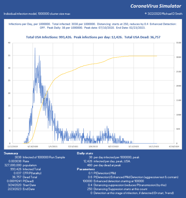
Now we have reduced the peak to 12,436 per day, which (times 0.06) is 746 ICU beds per day.  Doable.  But look what happened.  At such low suppression, the virus is skipping along the bottom, hanging on.  The total infected went up, we lost another 28,000 people, and the event lasts into 2023 with sustained suppression that whole time.  Not good.  So, let’s try 95% reduction:

2020-03-24 21_31_25-Window.png
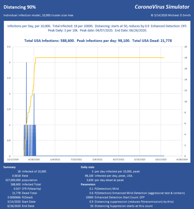
Why Distancing is Important

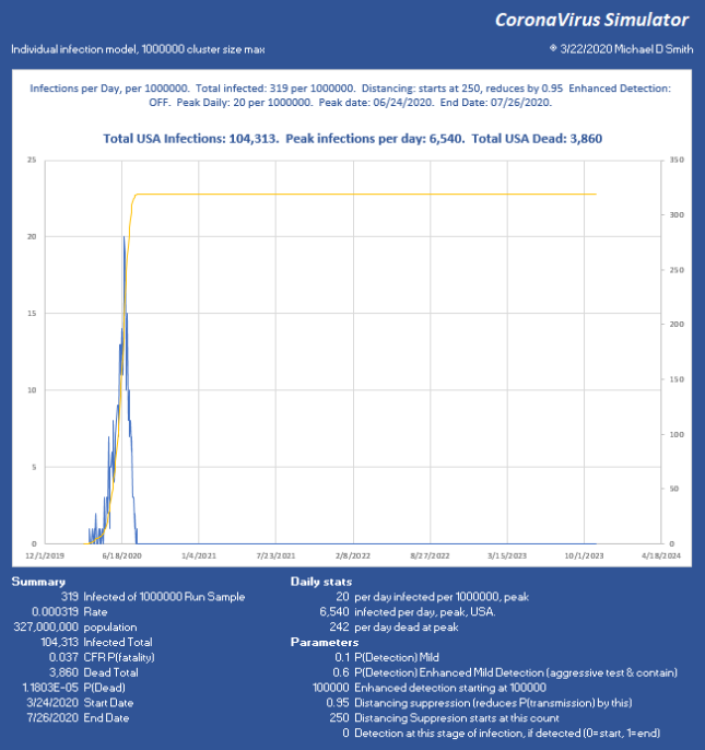
Now we stopped the infection progression at 319 of 1 million, only 69 victims after the moment we hit the brakes!  We have the peak at 6540 infections per day, USA, or just under 400 ICU beds per day, sustainable through the peak with the existing medical system, with ease.  So while we can run along doing medium suppression, much more aggressive action is far better and faster.  Of course, the distribution will not be uniform and large cities will likely be hit much harder than these numbers might indicate.

In these examples, with regard to the dates shown, remember, we’re starting from ONE infection, today, and letting it run.  In the above run, it takes from 3/24 to 6/24 to build up to the 250 count (near the peak) THEN we apply suppression, and the progression collapses just 33 days later.  The model doesn’t know how to start with 250 right now, it has to generate each infection and give it a serial number and track the progress and collect time stamps of each branch until it fails to progress and stops.  I can apply whatever technique I want to it any any point in the progression.  But, to be clear, you may need to subtract the growth period from the end dates to see how fast this could really end.

Sensitivity:

The model is very sensitive to factors that increase new hosts.  For example, right now the “infection attempts” integer is controlled strictly by the infectious period and the infectious rate, with the period being part of a distribution.  If I decide that I want to give it more of a natural feel so that some hosts infect many others while others don’t by adding another distribution, it can have a wildly different answer.  Because if you increase the chances of having 5 seeds instead of 2 or 3, even once in a while, that many more new clusters have a good chance of going exponential, so any factor that increases new hosts has a huge impact.  The good news is, any factor that diminishes that also has a huge impact!  So, by extension, people who ignore measures and infect many others are a really bad feature for the rest of us, extending both the peak and the duration of the pain.

Speed:

A study which I think is very promising (pre-print) by Wölfel et al. describes the shedding rate of the virus.  Just after onset, the shedding rate is extremely high but diminishes rapidly so that while virus may be detectable long after illness is over, viable virus capable of reproduction is mostly gone after 9 days.  By 7 days, the chance of transmission is down 50%.  The chart looks like this:

2020-03-24 21_48_22-Window.png

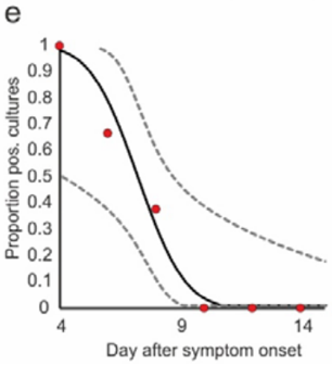
If this is true, and I added it, it will have the effect that the infection is more like a spark than an opportunity period, and transmission will be even more aggressive but shorter lived, which will still be MUCH faster than the current model.  In a static population, it would progress like a wave and sweep right through, more like a brush fire than small distributed fires.  This could be what is happening now, but I suspect it is somewhere in between.  In any case, this will reduce the event duration even more, making the end date very soon if hard suppression actions are taken now.  Good thing for the economy.

The usual yada yada:  These are comparisons, not predictions…  This is just a tool, with way too many parameters, many of which are not known precisely.  The inputs are values I get from various publications, but I have no idea whether this is how it will play out.  I do believe that distancing will work, as long as we only have some small leaks of a few new hosts.  There is no reason that most of the US needs to get infected, it all depends on the participation and effectiveness of the suppression.  I’m quite convinced though, that any scenario that does not include hard suppression now will either take too long, kill too many, or both.

There are some promising studies going on with other drugs that may make recovery much more likely, which could really help this situation, if high volumes of each are available.

New features

  • Individual infection progress and tracking on a Population size up to 1 million.
  • Original used uniform distribution for incubation, sickness duration, etc.  Now selectable with triangle.  Also tried gamma, normal, but incubation in particular needs to have the mode pushed way left to get the median and max to come out correctly to match estimates of a median 5.1 day incubation, with min at 2 and max at 11.5.  The cumulative distribution is a little tricky with triangular but I was able to implement it.  As suspected, this greatly reduces infection duration of the entire event.
  • Sensitivity analysis of any parameter.  If there is something you want to try, let me know.

2020-03-24 22_51_12-Window.png


1 Comment

Posted by on March 24, 2020 in Climate


CoronaVirus – An individual infection model

The world seems to be consumed by the news of CoronaVirus COVID-19 spreading.  Strategies to control the situation seem to be very general, and the more I see, the more I think we’re not using the most effective control strategies, and the ones we are using won’t really do what we think.  The media tells us how this will be over soon, with estimates of a few weeks!  Weeks!  Really?  I don’t see how given the features of the disease like undetected spreading and a long sickness duration in some cases, and the lack of protective gear and testing capacity.  How can it all stop in a generation or two?  Magic?  I decided to simulate it using some published figures, and see what conclusions I could draw.  I have attempted to simulate the propagation of individual infections using estimated parameters for R0, severity, incubation, sickness duration, infectious period, and so on.  Controls were added to institute various suppression, detection and containment strategies to find out which is most effective, and to estimate what testing capacity is required and when.

The Model

The model is a population of 10,000, which is seeded with a single infection to a random serial number of an individual.  That individual is assigned a severity, then the start time, incubation period, infectious start, sickness duration, sickness end, and infectious period end times are all assigned depending on severity according to some duration tables using the uniform distribution.  Detection is also calculated, generally as 85% if severe, and 10% if mild.  Based on all of those factors, a number of infection attempts is assigned, and whatever that count is (typically 0 to 10, mostly 2 to 3), that number of attempts will be made to infect new individuals, by generating new serials between 1 and 10,000.  If a serial has already been infected, it is not infected again.  Each new serial is processed the same way, which generates more new serials, more new infections, and so on.  New infections are assigned start times along the duration of the infectious period of the parent serial, such that if two new infections are generated, each will be assigned a start time of 1/3 and 2/3 of the way through the parent infectious period, and so on.  Not perfect but easy to do and reasonably nominal.

With various switches and non-linear controls involved, I can’t use R0 directly.  A test population of 10,000 was made and an infection rate driver was adjusted to generally yield R0 of 2.6 with no control methods or detection applied.  Then that driver was kept the same for all runs going forward.

Trigger levels can be assigned to activate on a certain number of infections to institute either an enhanced testing and containment strategy or distancing suppression.  Varying degrees of effectiveness can be used to control disease progression.

Once started, typical behavior is to either contain itself quickly (by starting with a severe case that is contained perhaps, or just luck of the draw that a short run fizzles out) or it runs rampant and multiplies.  If it starts and runs such that new infections expand, it will run until eventually either herd immunity will take over (due to a lack of viable hosts), or a detection, containment or suppression strategy will take over and drive R down to the point where the progression stops, then the result charts are generated.

Death is not assigned by the model, as the infection is removed from the available population and can’t be infected again, so it is effectively removed anyway.  Death estimates shown here use 3.7% of infected, which is probably on the high side initially when beds are available, but will be on the low side as the situation progresses due to lack of medical and testing capacity.

Yeah, but is the model correct?

No!  It is not even close.  Nobody knows enough to do this correctly, so it is just a tool, but I think it is useful, and it does more than the direct math does.  As John von Neumann famously said, “With four parameters I can fit an elephant, and with five I can make him wiggle his trunk”.  I have dozens here.  I make a lot of assumptions that are simply guesses, but I believe the take-aways are directionally – probably, hopefully, somewhat valid.  But take it with a grain of salt.  NOBODY knows how this will play out.  Even if my numbers turn out to be close, we will never know which parameters were right or wrong.  Just sayin’

Outputs

Model output is the histogram of daily results, total infected, peak infections per day,  peak date, peak deaths per day, total deaths, and the date of last recovery.  I apply the results from the 10,000 to the general population.  Not perfect, but these really will behave like separate outbreaks with some overlap, with new seeds starting other cells, etc.  Other errors are probably larger than that.  I could probably go to 100,000, or 1,000,000 and may try that next.

Controls (click image to expand)

2020-03-14 17_43_21-Window.png

Selected Results (chart titles and summary give treatment parameters and results)

2020-03-14 13_55_53-Window.png

Doing nothing is obviously not a good option, but the total infection rate of 55.5% is possible without doing anything.  It would be higher as might be estimated from a herd immunity of (1-1/R0), but the fact that we detect and contain severe cases reduces R before we start.  We are also being more careful and employing distancing already, so this chart is not realistic, and that is exactly what is expected.  The whole thing changes once people start changing their behavior.

Social Distancing

The suppression depends on how severely we distance ourselves.  It could be nearly 100% if we lock down populations tight, but let’s face it, this is not Wuhan and we aren’t going to put up with that here.  At least not at first.  I’m showing some charts with 30% effectiveness, which just means you reduce transmission rate by that much by chopping off 30% of the opportunity during a mild infectious period.  So 30% effective means about 30% of the time out of the population when we otherwise would have been out and about infecting others.

It turns out to be an interesting number because somewhere around 20 to 30%, the infection can propagate at a low level almost forever (many years) until herd immunity finally kills it.  I don’t consider the fact that new hosts are being born that whole time which will reduce the immunity.

The other thing that pops out is that some social distancing helps, but it also hurts.  You simply can’t keep people offline for years without knock-on effects like damaging the economy.  Total deaths will be reduced, but the duration stretches out, which is not a great option either.  Here you see that the infection sustained for a while then collapsed.  End date, mid 2022.  This varies quite a bit from run to run, something I might simulate soon.

2020-03-14 14_45_27-Window.png

More aggressive distancing does work better, and shortens duration, with a greatly reduced death toll.  50% distancing:

2020-03-14 15_18_33-Window.png

90% distancing could work too, but… 90%?  And it still doesn’t end until July, but you have to love the reduced infections and deaths:

2020-03-14 18_32_11-Window.png

Enhanced Detection and Containment.

In these runs, a brake is applied by aggressively detecting mild cases, with increased testing.  When a test result is positive, that person is contained.  It is assumed that containment occurs at onset, and detection is fast, with little chance (5%) of infecting others after that.  If anyone with any symptom is detected then contained, it has a very fast effect.  I don’t pretend to know how many are without symptoms, so I’m using detection of 60% of mild cases, so hopefully anyone with a fever gets tested and that is a reasonable estimate.  The next question is when do we start?  I set that at 0.5% (infection count of 50 out of 10,000), 100, 2000, whatever.  The length of time the spread remains uncontrolled has the largest effect on death and duration.  I show charts with varying levels of detection and waiting various lengths of time to start.  Speed matters:

Start at 0.5%

2020-03-14 15_10_56-Window.png

Start at 1%

2020-03-14 14_58_55-Window.png

Start at 2%:2020-03-14 19_31_51-Window.png

Combinations:

2020-03-14 15_45_29-Window.png

2020-03-14 15_38_48-Window.png

What happens if you wait too long to test:

2020-03-14 16_09_15-Window.png

Everything at once:

2020-03-14 22_28_16-CoronaVirus individual transmission model 20200314.xlsm - Excel.png

Test Capacity:

The longer you wait to begin testing, the more testing you need, by an incredible amount.  Doing a similar analysis as the above charts, here are some selected results:

2020-03-14 19_33_54-CoronaVirus individual transmission model 20200314.xlsm - Excel.png

Translation:  We will need to do 181,000 completed tests per day at the peak.  For every infection you delay before you start, you need another 247 per day.  Yes, you read that right.  1 infection of delay costs 247.  For the case of a fast peak with hard suppression (taking one of the charts above), we will need to get to 163,000 completed tests per day, by June 10th.  This means we need to increase test capacity by 6% PER DAY, EVERY DAY starting NOW to get there.  This says nothing of the inventory required as it is never where you need it, so you must carry plenty for each site, and move it around if in short supply in any given cluster.  Multiply by 5 as a starting point.  Now you need supplies for 815,000 to start, plus 200k per day for quite a while.  If you want to test everyone, start with temperature as a screen, or have 2 billion tests ready (you will need to test everyone every few days if you really want to stop it cold).

A National Effort

Am I right?  Who knows.  But I think a lot of systems will be caught off guard.  We don’t need to double or triple testing capacity, we need to multiply by 1000.  This won’t happen by itself.  It will require a monumental, Manhattan Project style effort, but it IS doable.  It is time for this to be crowd-sourced, with EVERYTHING published, and all possible sources sourced, right now.  You can’t multiply without multiplication.

  • The bill of material for every test kit, reagent, container, piece of equipment, delivery vehicle, all of it.  Work instructions, equipment specs, process flows, ALL OF IT.
  • The statement of requirements, specs and drawings for every single component of everything involved
  • The quantities currently available and the rate they are produced, and the deficit by date of every single part.  The deficit MUST be closed.
  • Plans for every supplier to go 24×7.  Plans to identify and ramp all new suppliers.
  • Limited validation.  Get it to 90% good and release, keep working on it.  The risk is MUCH better than waiting for a perfect result.
  • Specifications that can change.  Everything is negotiable.  (I can make the control panel but it might be copper instead of stainless, OK?  uh, sure!)
  • Mobilize a few thousand engineers, purchasing, project managers to arrange the builds and deliveries.
  • Change the design.  Think small and fast. Running out of test tubes?  Have the BIC pen company start making them by modifying the molds overnight.  Now you have billions of tubes.  Many things CAN be changed that fast.

Conclusions and comments:

The charts above show that testing is everything.  If we can detect and contain infectious people, we have to do that NOW.  It makes the ordeal much shorter with much less damage.  Every day of delay costs way too much.  There really is no other viable solution, they all take too long, won’t work, and too many die.  Yes, it improves the medical overload somewhat, but not enough, and we can’t do that forever.  Beyond the loss of life, the lost work and value is incalculable.  The strain on the financial system – well, you saw what a small poke did.

We are where Italy was less than TWO WEEKS ago.  We better bust a move, or we will have zero chance of a lower death rate like Korea.

Warnings:

*  Keep in mind that this model is generally starting from an infection point HIGHER than where we currently stand.  For example at 50 of 10,000, or 0.5%, we institute an action.  We are currently at 2,726 as of 3/14/2020 of 327,000,000 or 0.00084% (holy COW what a jump since the last time I looked, yesterday!).  So the results are overstated somewhat, and they could turn out to be much better than my simulations show if efforts start now.  Or worse.  It is expanding at a geometric rate, and time matters.  And the government is working on it.  Think about that!

** The use of uniform distributions for duration is probably stretching duration somewhat for each generation.  I will start using triangular if I get some time tomorrow.  Normal could work too but might give negative values for certain high negative sigma durations, probably won’t try that.

*** This is a first pass model…  I know it has some issues, quite a few things that should be better, but I enjoy building these and you have to start somewhere.  Its results may be useful if it helps get us testing faster.  Alright… Shoot holes in it!


Here is a very worthwhile article: https://medium.com/@tomaspueyo/coronavirus-act-today-or-people-will-die-f4d3d9cd99ca

UPDATE 3/15:

Triangle distributions were put in for all durations.  As I suspected, it reduces total variation of duration, so the “Do Nothing” wave tightens up a bit, mostly by eliminating some of the longer duration stragglers when using uniform.  The overall shape is about the same.  It is over in about 17 months, the peak shifts left 1 month:

2020-03-15 11_47_24-CoronaVirus individual transmission model 20200315 with Triangle Dist.xlsm - Exc.png


1 Comment

Posted by on March 14, 2020 in Climate


Corona Virus – Some Estimates

Just thought I would put this here on 2/1/2020 to see whether any of my projections (which are admittedly oversimplified) turn out to be in the ballpark…  I pray this disaster will fall far short of my initial estimates.  This is a simple projection of growth without regard for mitigation efforts, which seem to be reducing growth rates from 60% per day to 20% per day.  The outcome does not change much for those differences (only a few days difference to 99.9% infection).  Let’s have a look in 1.8 months.2020-02-01 00_12_14-Window

 
1 Comment

Posted by on February 1, 2020 in Climate

 
Image

US Midwest having its coldest beginning of year ever

I finally replicated Steve Goddard’s Charts!  And now have my solver added.

Compare and contrast: http://stevengoddard.wordpress.com/2014/04/29/coldest-year-on-record-so-far-in-the-midwest/

Steve’s:

And mine:

2014-05-01 22_19_56-Microsoft Excel - Midwest through 04282014.xls

That is some serious cooling going on here in the midwest.  About 1.5°F cooler now than in 1900.

You can do this too with Steve’s code, available here:  http://stevengoddard.wordpress.com/ghcn-code/


3 Comments

Posted by on May 1, 2014 in Climate


IPCC AR5 Claims in review – Last decades unusual?

Claim:  Each of the last three decades has been successively warmer at the Earth’s surface than any preceding decade since 1850.

I will be using GISTemp, which is available from 1880.

Decadal temperatures (GISTemp land stations)

2014-03-31 22_41_44-Microsoft Excel - GISSRunAndRankGlobal2014Land.xls

As a starting observation, 78.6% of ALL decades are ranked number one.  This ranking is taken since the beginning of the series, so a ranking of one means that the previous first rank was exceeded.  Here is the chart:

2014-03-31 23_00_57-Microsoft Excel - GISSRunAndRankGlobal2014Land.xls

Now to the question at hand… Is it unusual for the last 3 decades to successively warmer, and warmer than any other decade since 1850?  We can answer the question since 1880 with this dataset.  We can’t test the claim before 1900 since we need 3 successively warmer decades AND warmer than anything previous.


2014-03-31 23_35_14-Microsoft Excel - GISSRunAndRankGlobal2014Land.xls

Answer:  No, since 54% of ALL decades will make the claim true.  Notice also that the claim is not unusual before CO2 emissions became “important” by IPCC standards, at around 1945.  The decades before and since all have similar probabilities for making the claim true.

 
Leave a comment

Posted by on March 31, 2014 in Climate

 
Image

December 15th World Sea Ice

December 15th World Sea Ice

No trend once cyclical signals are removed.

Inspired by: Steve Goddard. http://stevengoddard.wordpress.com/2013/12/19/five-years-since-hansen-forecast-200-feet-of-sea-level-rise-and-total-polar-meltdown/

 
Leave a comment

Posted by on December 19, 2013 in Climate


Tags:

UAH Global: Trend and cyclical analysis as of July 2012: Zero trend.

Image

UAH Global temperature trend and acceleration after removing best fit cyclical variables.  Trend: 0.00002°C/year.  Acceleration: 0.0000094°C/yr^2.  “For entertainment purposes”, this is extended to 2100:  Note that the timing of the end of cooling has moved a little compared to many other datasets.  This one reaches a minimum in 2034, most others reach minimum around 2028 / 2030

 
Leave a comment

Posted by on August 4, 2012 in Climate


Colorado Drought

How can there be a drought:

When CO has received 4 to 10″ of rain in the last 60 days?

Image

 
Leave a comment

Posted by on August 2, 2012 in Climate


Colorado Annual Temps

The trend is half what NCDC claims (even using their wildly adjusted data).

Once you take out the cyclical component, the trend is 0.079°C per decade…

 
2 Comments

Posted by on June 30, 2012 in Climate

 
Aside

In response to:

http://stevengoddard.wordpress.com/2012/04/28/quantifying-the-death-spiral-of-climate-science/

The trend is down, at -.189 million km^2/yr.

Image

Trend is still down…

 
2 Comments

Posted by on April 28, 2012 in Climate


Northern Hemisphere UHI CRUTem3

This article describes another way to look at the northern hemisphere CRUTem3 data studied by Dr. Roy Spencer in the WUWT article here:

http://wattsupwiththat.com/2012/03/30/spencer-shows-compelling-evidence-of-uhi-in-crutem3-data/

Dr. Spencer identifies a spurious Urban Heat Island (UHI) influence of about 0.13°C per 39 years based on using 3 population density classes out of a possible 5.  He shows that this results in a UHI caused overstatement of the temperature trend by about 15% as he describes in the paragraph below:

The CRUTem3 temperature linear trend is about 15% warmer than the lowest population class temperature trend. But if we extrapolate the results in the first plot above to near-zero population density (0.1 persons per sq. km), we get a 30% overestimate of temperature trends from CRUTem3.

In Spencer’s chart below, he shows about 0.13°C over 39 years or about 0.0033°C per year exaggeration in the CRUTemp3 record caused by UHI:

The chart above shows spurious UHI content of about 0.0033°C per year (chart by Dr. Roy Spencer)

I used a method to remove cyclical signals from the entire dataset.  It is a technique I developed to minimize the least squares error by using a dual signal cyclical and exponential model of the temperatures (or anything else).  You could argue I have too many degrees of freedom to play with when I curve fit it, and you would be right, but the chart below represents a model with the least error that I could generate.  Other combinations work reasonably well too, but have more error than this one.

The section of the NH temperature dataset that Dr. Spencer chose to analyze from 1973 to 2011 is on one of the repeating sawtooth steeper areas of the temperature curve.  1973 was near the bottom of one of the last cooling cycles, right around the time of “the next ice age” scary news stories of the day.  This section of the curve also coincides with the steepest part of the sine components that fit well in my analysis.  So I would argue that this is much steeper than the long term trend and that Dr. Roy’s analysis therefore underestimates UHI.

As I show in the chart below, the section of the curve that Spencer analyzes is increasing at about 0.0163°C per year, of which 0.0033°C is UHI.  On my chart, that is about 20%; he uses 15% as a linear fit.  But the long term trend after removing cyclical items is only 0.0066°C per year.  So the UHI component is 50% of the long term trend (click to enlarge).

Dr. Spencer goes on to say that if more population classes were used, the amount of UHI increases dramatically, but since there are fewer items in each class, the data is statistically less reliable.

The conclusion I am pointing out here is that even without using more classes, I get a UHI contribution 2.5x higher since my divisor (slope) is lower comparing long term versus short term.  Using the paragraph above, if Spencer was able to get from 15% UHI influence to 30% UHI (2x) by extrapolating toward zero population (at 0.1 people per km^2), AND if I can get from 20% to 50% UHI (2.5x) by comparing the short term versus long term, is it possible that UHI in fact accounts for ALL or MORE than 100% of the observed increase in NH CRUTem3 data?

Summary / calculations:

0.0033°C/yr UHI Spencer basis * 2.5 LT.vs.ST * (2x extrapolation to zero population)=0.0165°C/yr.

The long term slope is only 0.0066°C per year, the short term slope is only 0.0163°C/yr.

Has Dr. Spencer found UHI accounting for more than 100% of the total measured increase?  It looks possible.

Now start adding classes which adds another very steep multiplier.  How important is UHI at much more than 100% of total influence?  Probably worth looking into!

Comments welcome.

 
Leave a comment

Posted by on March 31, 2012 in Climate


Contiguous U.S. Temperature March 1895-2011

March 1910 is the hottest ever in the Contiguous US:

But if you remove the cyclical elements, the trend drops to almost zero: (0.127°F/Century)

h/t to Steve Goddard

http://www.real-science.com/extreme-global-weirding-in-march-1910

 
Leave a comment

Posted by on March 21, 2012 in Climate


Luling, TX temperature deconstruction

See, the trend IS up.  At 0.04°F per century.  Long cycle at 109 years.

 
Leave a comment

Posted by on February 17, 2012 in Climate


Envisat Sea Level Deconstruction with 2 Waves

So much for sea level rise.  Going DOWN…

I thought I would have even more fun and try the best fit of two sine waves, trend, and acceleration.  After removing seasonal signals and the 25 year signal, the trend is down slightly, and the acceleration factor is also slightly negative.  The main effect is the Wave2 signal.

If the cycle should continue, you can expect a minimum around 2021 of 0.455mm, about 30mm lower than now.  And once again, I thought I would extend this out a few years and chart it, purely for entertainment purposes.


Leave a comment

Posted by on February 8, 2012 in Climate


UAH Global Temperature Deconstruction as of Dec 2011

UAH Global.  The trend is substantially lower once cyclical component is removed.  Click for larger image.

And for even more fun, another projection to 2100…  Any good alarmist will show something that accelerates, right?  And alarming it is indeed, a whopping 0.8°C.  And before you ask, yes, I’m quite sure the “Accel” parameter is accurate to 9 places  🙂

(quietly removes alarmist hat)

I’ve done dozens of these little exercises, using different techniques and datasets, and they seem to all point to cooling until 2028, ±.  This one says 2025.  But this is a projection, not a prediction, or whatever those guys call it…

UPDATE: I thought I had the January data but didn’t… Here is a chart with it.  Trend drops to 0.41°C per century.

 
3 Comments

Posted by on February 3, 2012 in Climate

 
Image

Sea Level Deconstruction

The latest Sea Level data from the University of Colorado

http://sealevel.colorado.edu/files/2011_rel4/sl_ns_global.png

This is a response to Willis Eschenbach’s post at WUWT, http://wattsupwiththat.com/2012/01/29/hansens-sea-shell-game/ .  I thought I would check whether sea level rise is accelerating, or decelerating.  This is pretty easy to test.  I also superimposed the best fit sine wave to capture any longer term cyclical behavior.

I was unable to model anything that would allow best fit using an accelerating parameter on an exponential function.  Deceleration did improve the least squares error, with or without the sine wave.  The factors are shown in the chart below (click to enlarge):

Note that the recent data shows obvious deceleration, as the best fit sine wave and -acceleration factors both show.  Note also that the best fit trend is only 2.24mm/year, well under Hansen’s estimates.  The rest of the total impact is a cyclical element with an amplitude of 7.04mm and a 25.3 year wavelength (of the last cycle at least).  You can see that the residuals are well centered around zero.

And since Hansen is so willing to make projections of things that are NOT in the data, I’m going to take the liberty of doing all those things Willis tells us not to do in the following chart – project these same factors over the next 88 years to 2100:

So there you have it… Declining sea levels until 2019, then rising again to 2033, and pretty much down hill from there.  Hmmm…  If my projection is based on actual data, does that make mine more credible than those a “real” climate scientist?


Update 2013/11/30:

SineWaveSolver20131130SeaLevel.xls

Acceleration is still negative in 2013 after removing the main cyclical component.  Recovery from the 2011 sea level blip cut the acceleration in half.

SineWaveSolver20131130SeaLevel2.xls

Update 2014/12/07:  Reader @AGrinstead thinks that more recent data will change the outcome:

AslakGrinstad 2014-12-07 23_07_44-Twitter _ Notifications

He’s right.  More recent data makes the deceleration even more clear than before.

2014-12-07 22_54_47-Microsoft Excel - SineWaveSolver20141207SeaLevel.xls

This drops the date for zero sea level rise by a few decades:

2014-12-07 22_59_54-Microsoft Excel - SineWaveSolver20141207SeaLevel Chart 2.xls


1 Comment

Posted by on January 30, 2012 in Climate


HadSST2gl Sea Surface Temperature Deconstruction

 
Leave a comment

Posted by on January 29, 2012 in Climate


HadCRUT3vgl Global Temp Deconstruction

HadCrut3vgl… New, more precise goal seeker written by me now in use.

 
Leave a comment

Posted by on January 29, 2012 in Climate


Global Temperature Deconstruction

(click to enlarge)

Global Temperature factors for sine wave, trend, acceleration using GISTemp (highly suspect starting data)

 
Leave a comment

Posted by on January 28, 2012 in Climate


USA Run and Rank Analysis

(click to enlarge)

USA temps show nothing unusual in terms of rank… Slope is now negative, only a few values even in the top 10 lately, which should be a common event in rising temperatures.  Only 6 times in the record were temperatures ranked number one.  One of those was in 1998, the last previous was in 1934. The frequency of top 10 events is not unusual at all, and the length of any runs of top 10 temperatures is low compared to global temp runs in the top 10 (currently at 18 years).

 
Leave a comment

Posted by on January 28, 2012 in Climate